How to Create Shareable Infographics About Your Music and Career

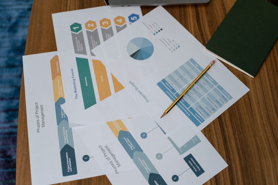
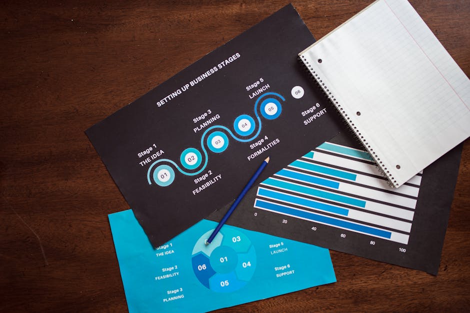
Infographics have become a powerful tool for musicians looking to share their music and career highlights in a visually engaging way. With the rise of digital content, artists face the challenge of standing out in a crowded space. Infographics offer an opportunity to simplify complex data, tell a compelling story, and capture attention quickly. Whether you're promoting a new album, showcasing your streaming statistics, or sharing your tour dates, creating shareable infographics can help you connect with both existing fans and potential new listeners.
Why Infographics Matter for Musicians
Musicians often juggle multiple aspects of their careers, from managing social media to coordinating releases and tours. It's easy for key information about your career to get lost in the mix. This is where infographics come into play. Not only do they make data more digestible, but they also help you communicate your achievements and updates in a way that’s easy to understand at a glance.
For instance, streaming platforms such as Spotify provide artists with detailed analytics on their performance metrics. Instead of presenting these numbers as plain text or pie charts, artists can turn them into colorful graphics that highlight important milestones like total streams, monthly listeners, or growth trends. These visuals are far more likely to be shared by fans across social media channels.
Additionally, research shows that people are more likely to remember information presented visually. According to MIT’s Human Vision Lab, the human brain processes images 60,000 times faster than text (MIT.edu). This means that crafting an eye-catching infographic can significantly boost engagement with your content.
Identifying Key Data Points
The first step in creating a successful infographic is identifying the key data points you want to showcase. Think about what your audience would be most interested in: Is it your growing number of streams? The success of your recent tour? Or perhaps the number of countries where your music has been played?
Here are some ideas of data you could include:
- Streaming statistics (total plays, unique listeners)
- Social media growth (follower increases across platforms)
- Tour dates or past performance locations
- Awards or recognitions you've received
- Collaborations with other artists
Your choice of data should align with the message you’re trying to convey. For example, if you're promoting a new album release, showcasing the number of pre-saves or streams in its first week might be most relevant. If you're focusing on international reach, highlighting how many countries your music has been streamed in could be impactful.
Selecting the Right Design Tools
Once you've gathered your data points, it’s time to select a design tool that fits both your skill level and needs. While there are numerous options available for creating infographics (ranging from beginner-friendly platforms to professional design software) choosing the right one depends on how comfortable you are with graphic design.
| Tool Name | Best For |
|---|---|
| Canva | Beginner-friendly with drag-and-drop interface; offers free templates |
| Adobe Illustrator | Professional-level customization; great for experienced designers |
| Piktochart | User-friendly platform tailored specifically for infographics creation |
| Visme | Offers advanced features like animations and interactive elements |
If you're just starting out and have minimal experience with design tools, Canva might be the best option because it offers pre-made templates that can be easily customized. For those looking for more advanced options, Adobe Illustrator provides full creative control but has a steeper learning curve.
Design Principles to Follow
A visually appealing infographic should follow basic design principles to ensure clarity and impact. Poorly designed graphics can confuse viewers or fail to communicate the message effectively. Keeping things simple while maintaining visual interest is key.
Here are a few design tips:
- Keep it clean: Avoid overcrowding your infographic with too much information or too many visual elements. Stick to one main idea per infographic.
- Use consistent fonts and colors: Select fonts and color schemes that reflect your personal brand as an artist while ensuring readability and contrast.
- Create a visual hierarchy: Use size and boldness to draw attention to the most important statistics or headlines first.
- Balance text with visuals: Infographics work best when there’s an even split between text and imagery. Use icons or charts to represent data instead of long blocks of text.
- Use high-quality images: If including photos of yourself or other visual elements like album covers, make sure they are high-resolution so they look sharp even when resized.
An effective infographic not only looks great but also communicates its message clearly. Remember that simplicity often works better than overcomplicating things with too many design elements.
Optimizing for Social Media Sharing
If you want your infographic to go viral on social media, it needs to be optimized for different platforms. Each social network has its own preferred dimensions for images and posts. For example, Instagram favors square images (1080 x 1080 pixels), while Twitter allows slightly wider images (1200 x 675 pixels). You’ll need to resize your infographic accordingly before sharing.
You can also encourage sharing by including calls-to-action (CTAs) within the infographic itself. These could be as simple as “Share this if you love indie music!” or “Tag a friend who would enjoy this playlist.” Adding social media handles and hashtags directly into the graphic can further increase visibility when it's shared by others.
Telling Your Story Through Infographics
A well-crafted infographic can do more than just present numbers, it can tell your story as an artist. Whether you're illustrating how far you've come since releasing your first song or highlighting pivotal moments in your career (such as signing with a label), use infographics as part of your narrative-building process.
You could create a timeline-style infographic showing key milestones in your journey: first gig played, first album released, major collaborations, etc., offering fans insight into both your successes and struggles along the way. This not only helps humanize you as an artist but also strengthens emotional connections with fans who feel like they're part of that journey.
The Benefits of Consistent Infographic Creation
The more consistently you create shareable infographics around different aspects of your career (whether it’s tour dates or streaming milestones) the better chance you'll have at keeping fans engaged over time. Frequent updates using infographics allow followers to stay informed without feeling overwhelmed by large amounts of data presented at once.
This approach also helps build brand recognition over time since fans will start associating certain visual styles (fonts/colors) with you specifically whenever they see those shared across their feeds. If done right over time (as part of an ongoing strategy) this could increase fan loyalty while attracting new listeners interested in what makes each update unique compared to others online already cluttered with content everywhere they look today!
Using Infographics Effectively in Your Music Career
The use of infographics allows musicians like yourself not only simplify complex information but also engage audiences visually, a crucial advantage given how fast-paced digital interactions tend toward today online globally! Combining thoughtful design principles relevant content will help ensure maximum reach potential social media channels too ultimately driving awareness growth long term whatever goals may happen pursuing musically speaking professionally personally alike overall
